In a fast-paced environment, speed often comes at the expense of structure. At IU International University, multiple brands had to be onboarded fast and websites were built rapidly. The lack of systematic thinking left the opportunity to create a more scalable and structured system.
🧜🏻♂️ Design System User Problem: Stakeholders struggled to understand how different brands were applied to UI Elements, slowing down workflows and introducing errors.
🦄 User Problem: Inconsistent design and broken elements across websites harmed user experience, with accessibility and visual issues.
🏢 Business Problem: Development and refinement of features were inefficient. QA frequently uncovered critical issues, delaying launches and impacting time to market.
Goals & Opportunities:
Improve Time-to-Market: Optimize design processes and streamline design-to-development handoff to accelerate feature implementation.
Minimize Errors: Reduce QA failures related to UI and multi-brand inconsistencies.
Increase Onboarding Efficiency: Shorten the onboarding time for new brands, and their stakeholders, into the multi-brand system.
🙋♀️ My Role:
I led the design efforts to establish a scalable, logical system for color tokens.
Research: Investigated tokenization concepts, recommendations, and best practices.
Collaboration: Partnered with engineering and design to ensure feasibility and scalability.
Design: Tested the logic in Figma, iterating based on feedback.
Documentation: Crafted guidelines to ensure the system’s usability.
⌚ Project Period: Q3–Q4 2024
🔧 Design tools: FIGMA
What even is a Color Token?
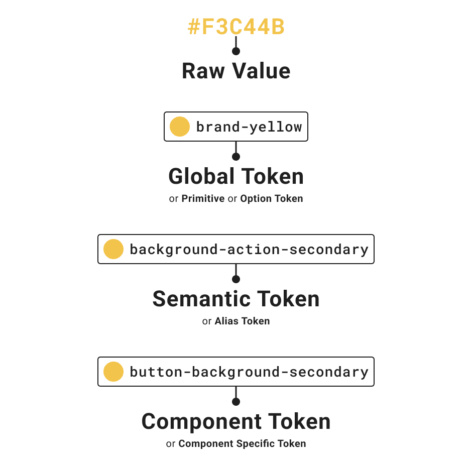
Color tokens are named entities that store specific color values and are the source of truth across design and development.
Example: Instead of repeatedly using a hex value like #FF5733, or a primitive name like 'yellow-100' we use a token name like 'primary-background'
A semantic token is named for how or where it's used, which means the name has a little inbuilt documentation.
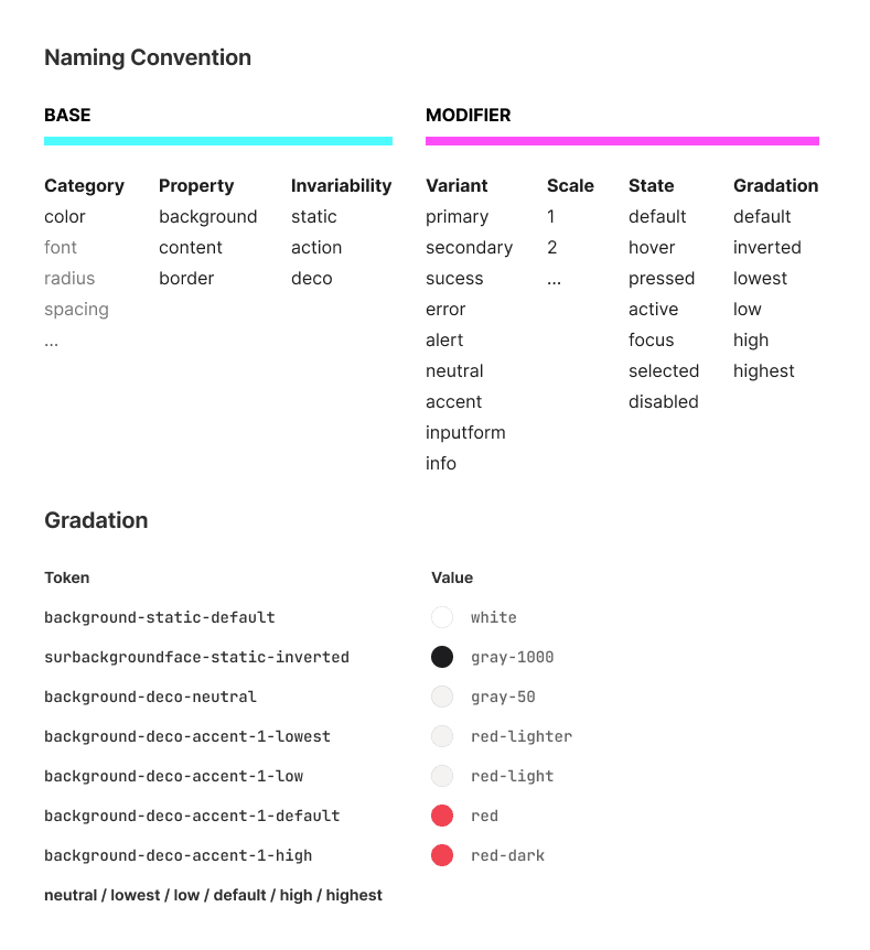
Naming Convention
The first step was to create a scalable naming convention that met our system’s needs and brought clarity to the multi-brand environment.
Key decisions:
Stay Simple: Grouped similar use cases and reduced the amount of differentiators used.
Team Feedback: Collaborated with designers and developers to refine terminology. For example, we chose “Background” over “Surface” as it was already understood by our teams.
Consistent Gradation: Applied a structured hierarchy of color to ensure clear application.
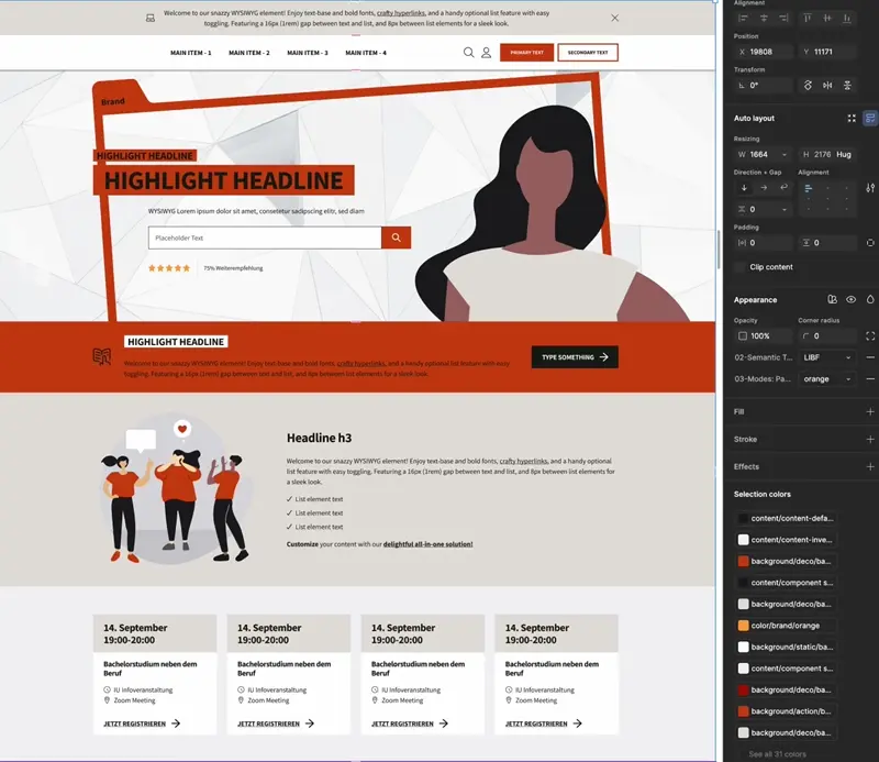
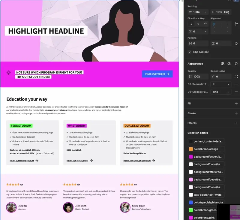
Creating and Testing Tokens in Figma
We set up our primitives and created an initial set of 96 semantic tokens to cover all anticipated use cases. We organized the tokens into Figma variables and applied them to over 200 Figma components to:
Identify gaps or missing tokens.
Refine naming and reduced redundancy
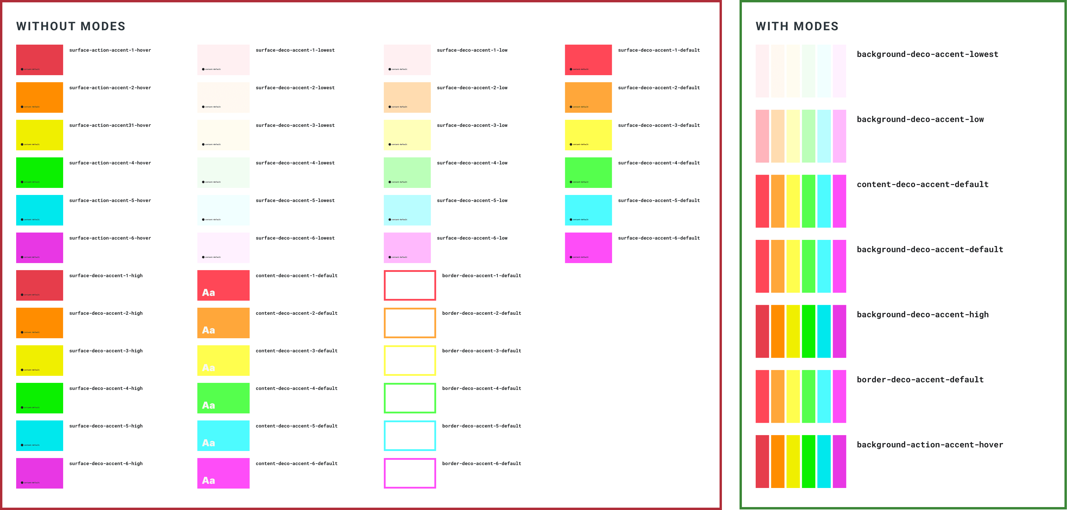
Introducing Modes
😰️ We ran into a challenge: The main IU Brand required six unique accent colors for the same semantic purpose while other brands only needed one.
To address this we added an additional layer of tokens called "Modes" to manage these accent colors under a single semantic token without affecting other brands.
Result:
Token Reduction: we significantly reduced the number of tokens, while maintaining flexibility.
Improved Usability: made it easier for designers to switch between colors without manual overrides.
Primitive colors instead of tokens were used sparingly to handle rare, one-off needs without overcomplicating the system.
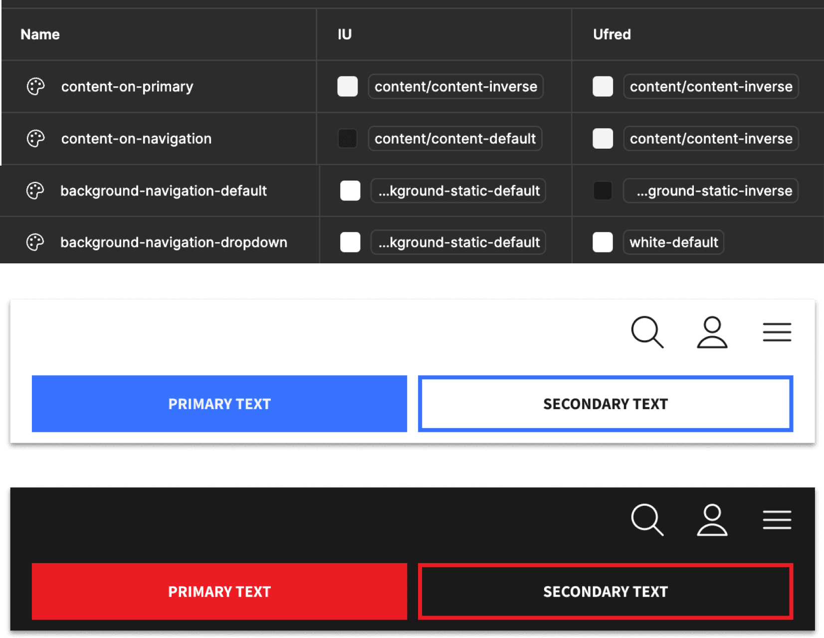
Testing with multiple Brands:
Onboarding each brand presented unique challenges that required thoughtful trade-offs:
Adjustments to existing tokens due to specific accessibility standards and unique color contrasts.
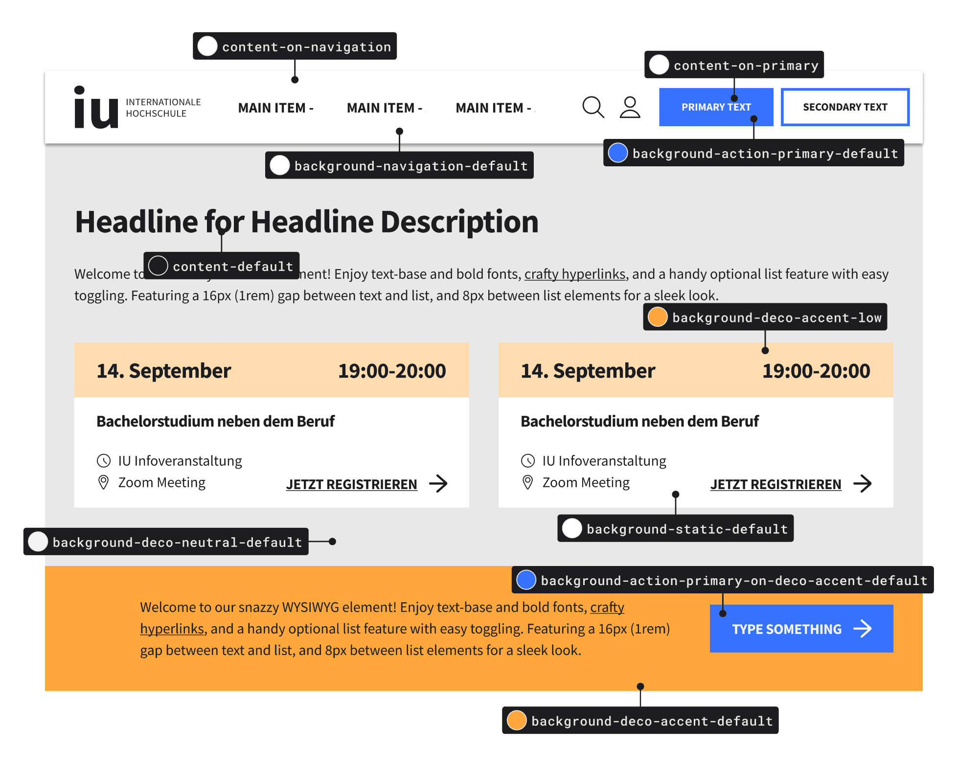
Some components with different color logic required component-specific tokens for example 'background-navigation-inverse' this way we could target these areas without affecting others and our overall logic.
To ensure simplicity and scalability, we avoided creating component specific tokens for all edge cases unless they were critical for frequently used components like navigation and buttons.
Through this iterative process, we refined the color token system to balance flexibility and efficiency.
The final count was 70 semantic tokens, ensuring the system remained lean while meeting the diverse needs of all brands with component specific tokens.
🔥 The proposed color token system has already improved team efficiency within the Figma environment:
Designers and developers are now aligned on naming conventions and workflows.
Feedback from early adopters highlights the potential for smoother collaboration and faster delivery times.
💛 Key Takeaway: The project demonstrates a scalable approach to managing multi-brand complexity while fostering collaboration across teams. It sets a strong foundation for consistent and efficient future development.
Ready to explore the behind-the-scenes of the Figma Library creation? Click here to read the case study.