Rebuilding a Figma Component Library

Rebuilding a Figma Component Library

Rebuilding a Figma Component Library

Built a scalable Figma Library aligned with the codebase - featuring flexible components, intuitive structure, and embedded documentation to streamline workflows and support growth.

Built a scalable Figma Library aligned with the codebase - featuring flexible components, intuitive structure, and embedded documentation to streamline workflows and support growth.

Built a scalable Figma Library aligned with the codebase - featuring flexible components, intuitive structure, and embedded documentation to streamline workflows and support growth.

The Problem

The Problem

The Problem

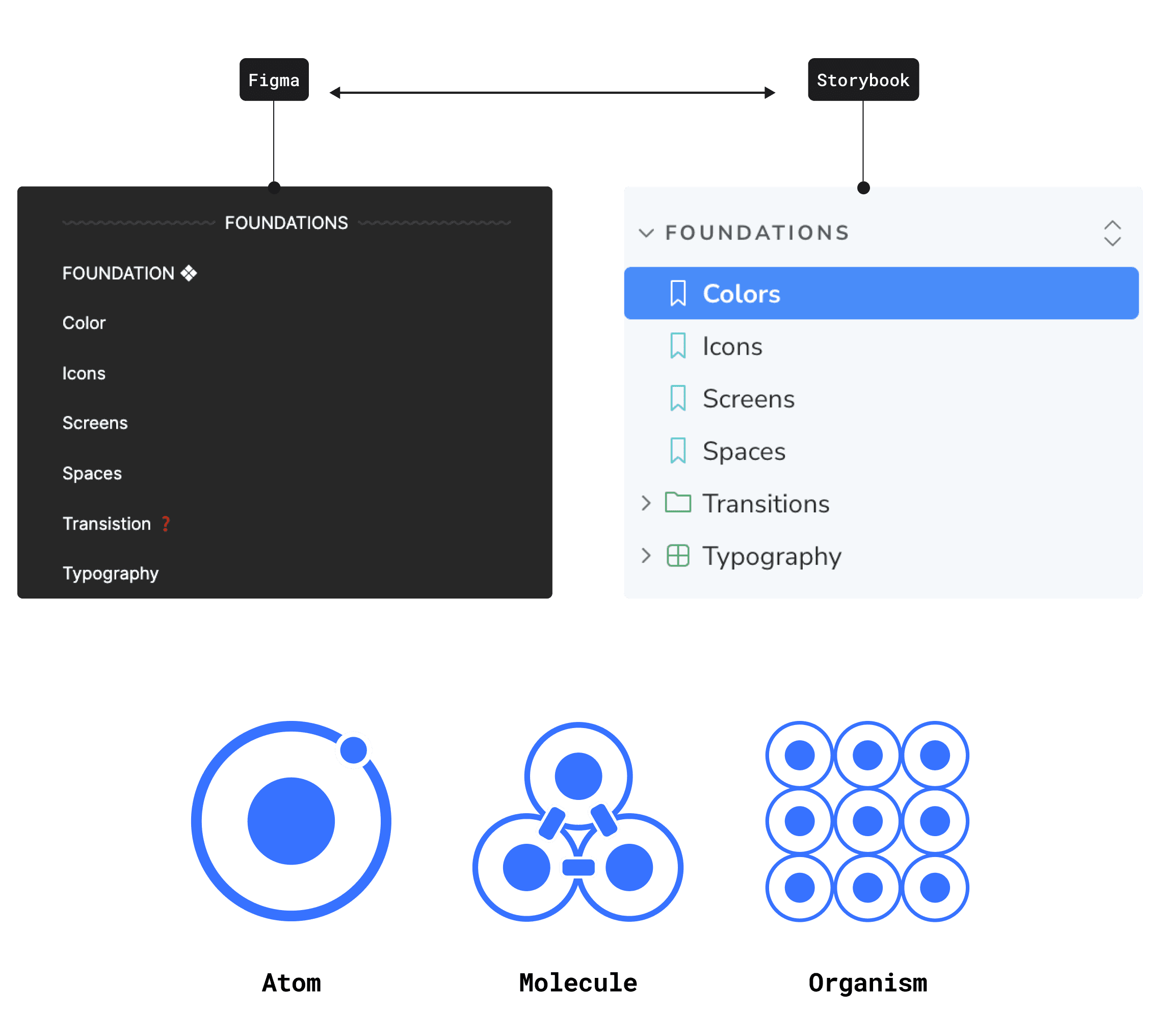
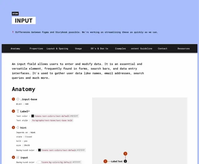
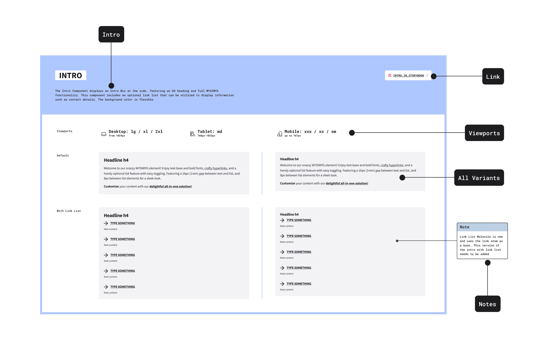
At IU International University, a CMS migration merged multiple products and websites into one platform. Development moved quickly, adopting Storybook as the component library, but design was left behind without a unified system. This created an opportunity to rebuild the Figma Library and unify a scalable design system.

🦄 User Problem:
Designers faced duplicate work and struggled to maintain consistency.

🏢 Business Problem:
Handoffs were unclear, slowing collaboration and feature rollouts.

Goals & Opportunities:
Streamline workflows
by aligning the Figma library with Development.
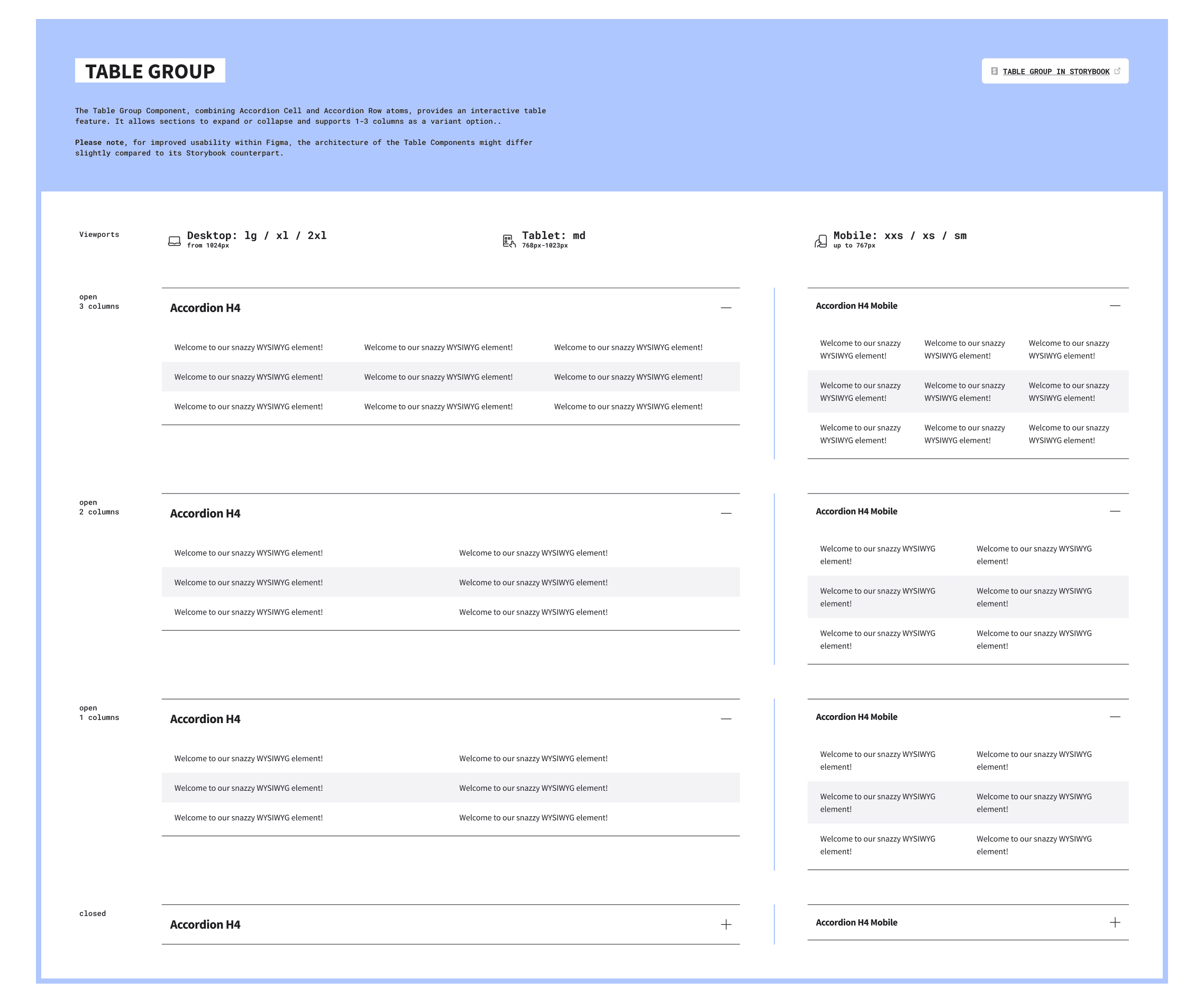
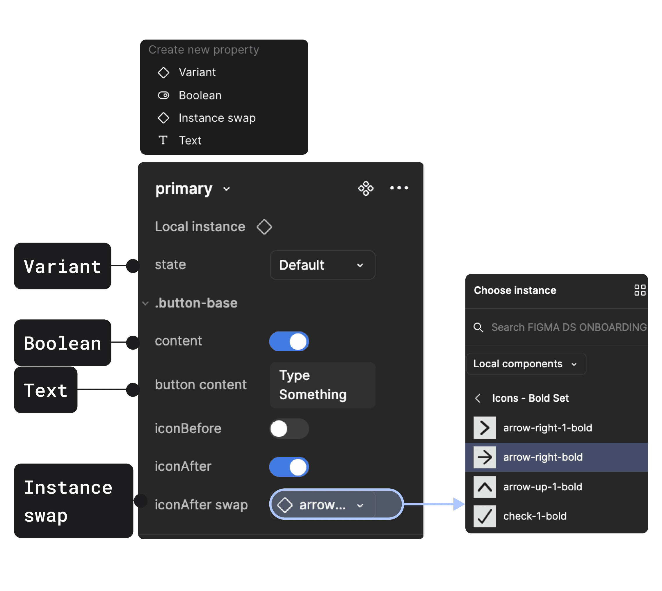
Ensure scalability with flexible, reusable components.
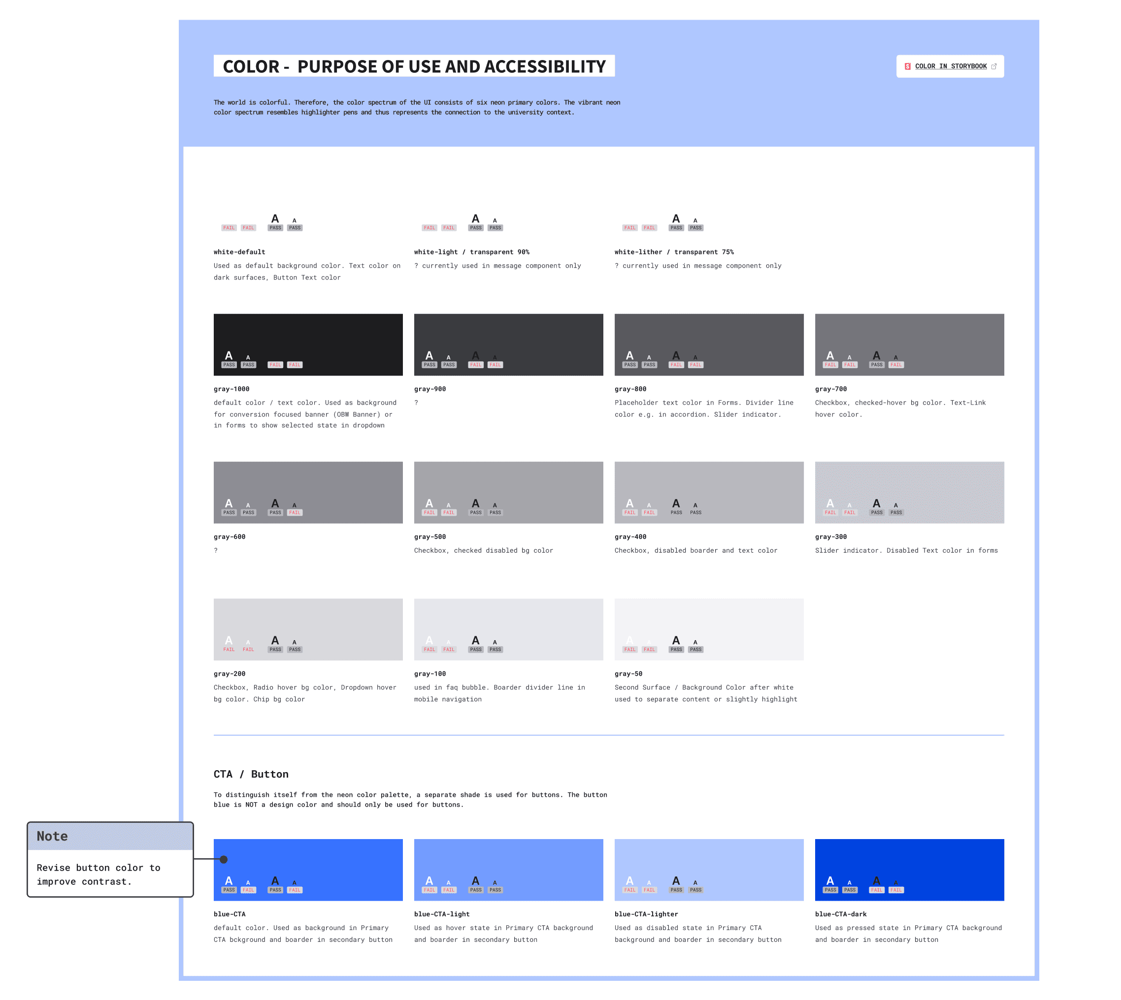
Improve collaboration through shared documentation and naming standards.

Project Detail

Project Detail

Project Detail

My Role

I led the design and implementation of a scalable Figma component library aligned with developer tools to support both development and design consistency.

  • Research: Audited gaps, analyzed best practices, and scoped the project.

  • Planning: Defined priorities, built a roadmap, and tracked progress in Jira.

  • Design Execution: Building the Figma library and components.

  • Collaboration: Partnered with management, designers, and developers to refine workflows and drive adoption.

  • Documentation: Introduced structured documentation to speed up onboarding and reduce friction.

Timeline: 4 months (Q2–Q3 2023)
🔧 Tools: Figma, Storybook, Generative AI

Project Process

Project Process

Project Process

Research & Planning

I audited the old Figma libraries and Storybook structure to document inconsistencies and gaps. My interviews with designers and developers uncovered pain points, and my best-practice research shaped the library’s structure and priorities.

Key Decisions:
Single File Setup:
Consolidate everything into one Figma file, mirroring Storybook for easier collaboration.
Scalable Roadmap: Focus first on high-impact components and document gaps directly in Figma for future updates.
Atomic Design Approach: Stick to atomic design principles, and keep the system lightweight by including only key organisms.

File Set-Up

I mirrored Storybook’s structure in Figma, making components easier to find and speeding up adoption by building on familiar workflows.

Dedicated Component Pages: Showcasing variants, states, and viewports and also a link to Storybook for codebase reference.
Component Source Pages: Stored all main components in protected source pages to prevent accidental edits.
Grouped Elements: Combined related components, like cards, for easier navigation in an alphabetically sorted setup.

🖍️ I also established branding for the library, distinct from the main brand to signal the design system environment, and support future multi-brand scalability.

Accessibility

Accessibility was a focus from the start. While deeper audits were planned for later iterations, the first release ensured foundational compliance by:

Color Audits: Documented contrast rules and provided examples.
Component Notes: Highlighted accessibility considerations for buttons, forms, and interactive elements.
Guidance for Iterations: Flagged areas needing further refinement to meet web content accessibility guidelines.

Component Architecture & Naming Standards

I built our Figma components for usability and scalability and responsiveness by using:

Base Components: Simplified future updates
Variants & Properties: Added toggles, swaps, and states to streamline edits
Responsive Design: Used viewport variants and width constraints to ensure responsiveness and prevent misuse across breakpoints.
Code Alignment: To match development as close as possible and ensure deviations were documented for later refinements.
Consistent Naming & Architecture: To ensure familiarity and support quick adoption.

Documentation

To speed up delivery, I embedded documentation directly within Figma, making it accessible from day one:

Skeleton Structure: Every component followed a consistent format, covering anatomy, usage, spacing, do’s/don’ts, content guidelines and more.
AI-Powered: Developed a reusable AI prompt to help the team quickly generate consistent documentation in the future.
Plugins & Specs: Used plugins to create detailed specs, improving accuracy and maintainability.


Result

Result

Result

💪🏻 I delivered a streamlined Figma library with 240+ components and 73 styles, enabling faster workflows and reducing inconsistencies across teams. Figma analytics showed 20,000+ component inserts within the first 90 days, demonstrating strong adoption with minimal component detachment.

🧡 Designers reported faster design times because of component usability and availability of components, while developers noted smoother handoffs.


Before vs After:

The old Figma libraries lacked structure and alignment with the codebase. The rebuild introduced:
Unified Framework: For consistency, improving usability.
Documentation: Specs and guidelines, reducing onboarding time.
Scalable and Responsive Components: Flexible setup with variants and properties to simplify edits and customization.
Change Log & Updates Channel: To track updates, and a dedicated channel to keep teams informed about releases.


🔥 Continuous Improvements

Early feedback highlighted areas for refinement, leading to dedicated follow-up projects:

Scalable Tokens: To support multi-brand scalability learn more in the Tokens Case Study.
Workflow Enhancements: Improved onboarding and branching workflows covered in a separate Collaboration & Workflow Case Study.

💡 Key Takeaway:
The newly designed library sets the foundation for a scalable, collaborative design system, enabling teams to move faster, stay consistent, and continuously improve.

Thank you for your attention

More Case Studies

Want to work with me?

Want to work with me?

Want to work with me?